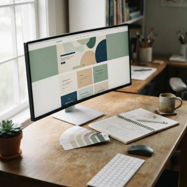
A beautiful website that nobody can use is a failure, and a plain website that solves the visitor's problem in seconds is a success. Good web design is less about decoration than about decisions: where to put the phone number, how long a form should be, which words to place on a button. This guide covers practical design choices that help small business sites look professional, load quickly and turn curious visitors into inquiries, even when the budget is modest and the team is small.
Design Around One Main Action
Every page should have one thing it wants the visitor to do. On a homepage that may be to request a quote, on a product page to add to cart and on a contact page to send a message. Place that action where it is easy to see, repeat it after key sections and avoid competing buttons of equal weight. When everything is highlighted, nothing stands out.
Ask a friend to look at your page for five seconds and then tell you what they remember. If they cannot name the main action, simplify.
Create a Clear Visual Hierarchy
Visitors scan before they read. Use large, bold headings, generous spacing and contrasting colors to guide the eye from the most important element to the least. Keep line lengths comfortable, usually between fifty and seventy-five characters, and use consistent sizes for similar elements.
Limit yourself to two fonts and a palette of three or four colors, because consistency makes a site feel trustworthy and speeds up reading.
Navigation That Makes Sense
Name menu items in words your visitors use, keep the main menu to five or six links and make the logo return to the homepage. Add a visible search box on larger sites and breadcrumbs for deep pages. Include contact details in the header or footer, since many visitors come to find exactly that.
Test navigation by giving three people a task, such as finding opening hours, and watching where they click.
Speed Is a Design Feature
Slow sites frustrate visitors and rank lower. Compress images, use modern formats, limit the number of fonts and scripts and choose fast hosting. Test your pages with free tools, and fix the largest problems first, such as oversized photos.
Every extra second of waiting loses a share of visitors.
Mobile Design Comes First
Most visitors use phones. Make buttons large enough for fingers, keep text readable without zooming, avoid hover-only menus and test forms with on-screen keyboards. Place the most important content at the top, and make phone numbers tap-to-call.
The MDN web accessibility guide explains how to build pages that work for every user and device.
Content That Builds Trust
Real photographs, client logos, short testimonials, clear prices or ranges and a page about the people behind the business reduce doubt. Write in plain language, state what you do in one sentence on the homepage and answer common questions on a dedicated page.
Update the site regularly, since outdated news makes a business look inactive.
Planning for a French-Speaking Audience
Many businesses serve visitors in Canada, Belgium, Switzerland, France and Africa. French text is usually longer than English, accented characters must display correctly, and punctuation conventions differ. Companies that commission english to french translation for web pages should design layouts with flexible spaces, provide screenshots for context and have a native reviewer test every form and button.
Use a visible language switcher, not automatic redirection that traps visitors.
Video, Audio and Captions
Short product videos and customer stories bring pages to life, but they must be accessible. Add captions, offer a transcript and avoid autoplay with sound. Our article on transcripts for web video explains how transcripts are prepared and how they also help search visibility.
Compress videos and host them on a reliable platform.
Forms That People Complete
Ask only for what you need, label fields clearly, show helpful error messages and confirm submission on screen and by email. Reduce the number of fields, and test on mobile.
A short form usually converts better than a long one.
Accessibility Basics
Use sufficient color contrast, descriptive link text, alternative text for images, keyboard navigation and clear headings. These steps help people with disabilities and improve usability for everyone.
Test your site with a screen reader at least once.
Search Visibility
Write unique page titles and descriptions, use headings in logical order, create useful content and earn links by being helpful. Make sure your site is secure and mobile-friendly.
Good design and good search practice go together.
Maintenance and Security
Update software, back up regularly, use strong passwords and monitor uptime. Review analytics monthly to find broken pages and slow spots.
A small maintenance routine prevents big problems.
Final Thoughts
Strong web design combines clarity, speed, trust and care for every visitor. Focus on one main action, keep layouts simple, design for phones and plan for several languages.
Test with real people and keep improving.
Choosing Images and Icons
Pick photographs that show real people, products and places, and avoid generic stock pictures that visitors recognize. Keep a consistent style, crop images to match your layout and add alternative text. Use simple icons to support text, not replace it.
Good imagery tells a story in one glance.
Working With a Designer
Prepare a brief with goals, audience, examples you like and your budget. Ask for a clear timeline and agree on revisions. Provide content early, since late text delays launches. Keep ownership of your domain and files.
Good communication produces better results.
After Launch
Monitor traffic, forms and speed, collect feedback and plan small improvements each month. Test new headlines, update photos and add useful content. A website is a living tool.
Regular care keeps results strong.
Building Trust With Clear Pricing and Policies
Visitors hesitate when prices are hidden or policies are unclear. Show a price range or a starting price, explain what is included and state delivery times, refunds and warranties in plain language. Add a short frequently asked questions section that answers the doubts you hear most often on the phone.
Transparency reduces wasted inquiries and increases the number of serious ones.
Photography and Visual Identity
Original photographs of your team, workspace and finished projects tell a more convincing story than generic images. Shoot in natural light, keep backgrounds tidy and show real faces with permission. Use the same style of editing across the site, and compress files so that pages stay fast.
A consistent look makes a small company feel established.
Planning Content for Several Languages
If you serve customers in more than one language, decide which pages truly need translation first, such as the homepage, services, pricing and contact. Keep text short and easy to adapt, avoid idioms, and supply translators with screenshots. Review each language version on a phone before launch.
Do the essentials well before translating everything.